The US-based social enterprise Start Small Think Big had made its name by partnering with law firms to offer pro-bono legal services to start-ups – and has over time added financial and marketing services too.
95% of their work is with small businesses owned by women and people of colour, including LGBTQIA+ communities, veterans, those with disabilities, and those on government hand-outs. They help hundreds of these businesses grow – which in turn helps their wider communities and tackles inequality.
To deliver on their expansion plans, their brand needed to work harder, and better explain what they do. Their work is incredibly purposeful, yet the way they explained it often sounded stiff and corporate, and their visual brand had become very generic.
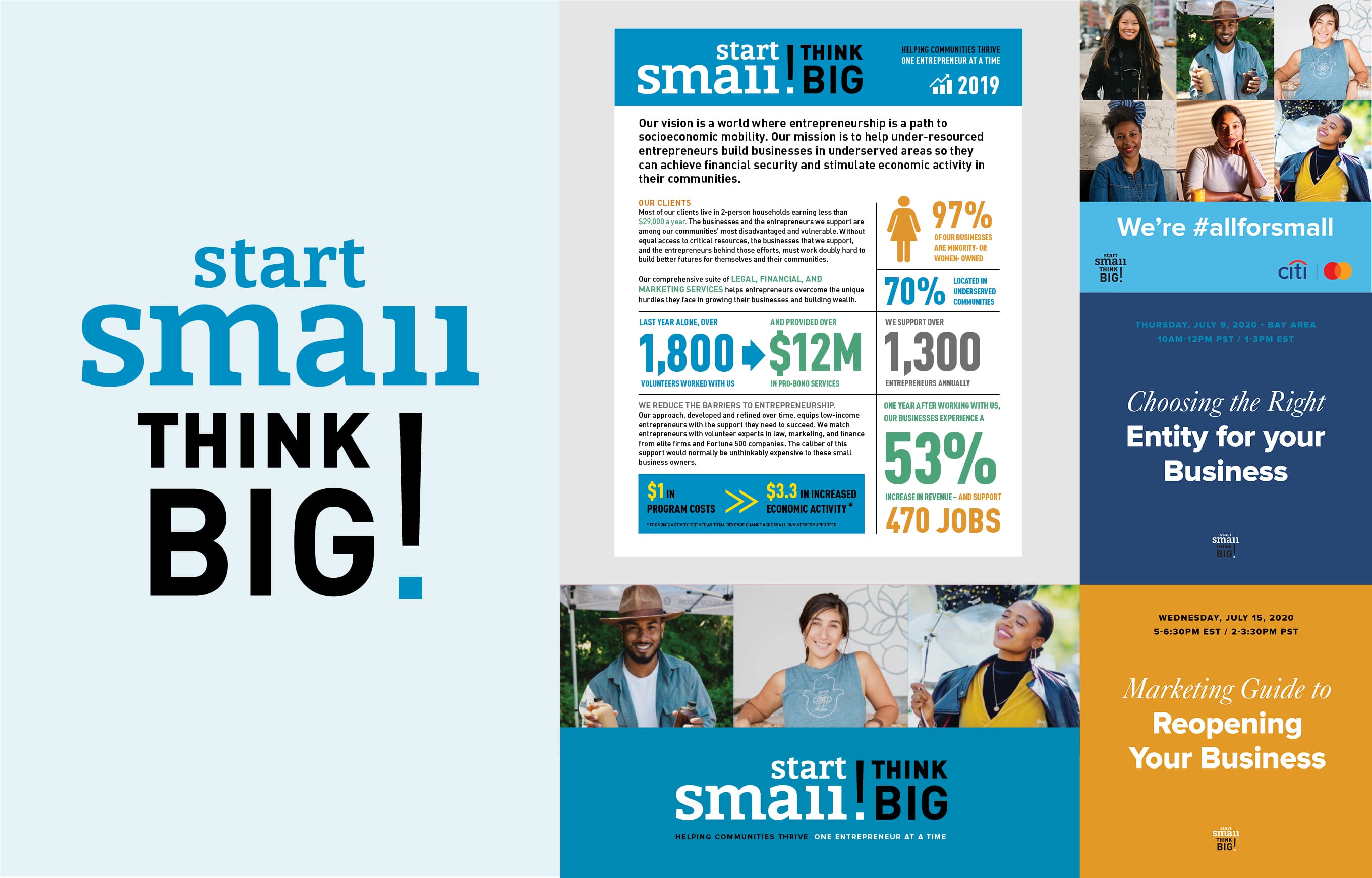
We loved their ethos and approach. Our task was to find the right words, symbolism and design toolkit to best express what they do, across multiple audiences. These varied hugely: from small businesses and entrepreneurs; to employees of larger firms looking to volunteer their skills to do good; to potential corporate partners and trusts hoping to ‘do their bit’ or help with funding.
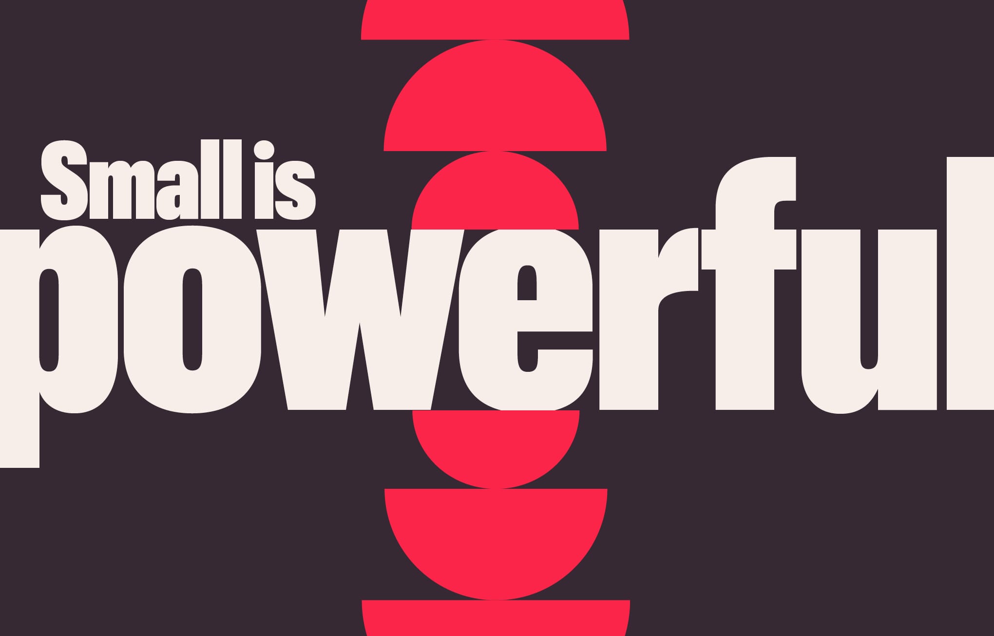
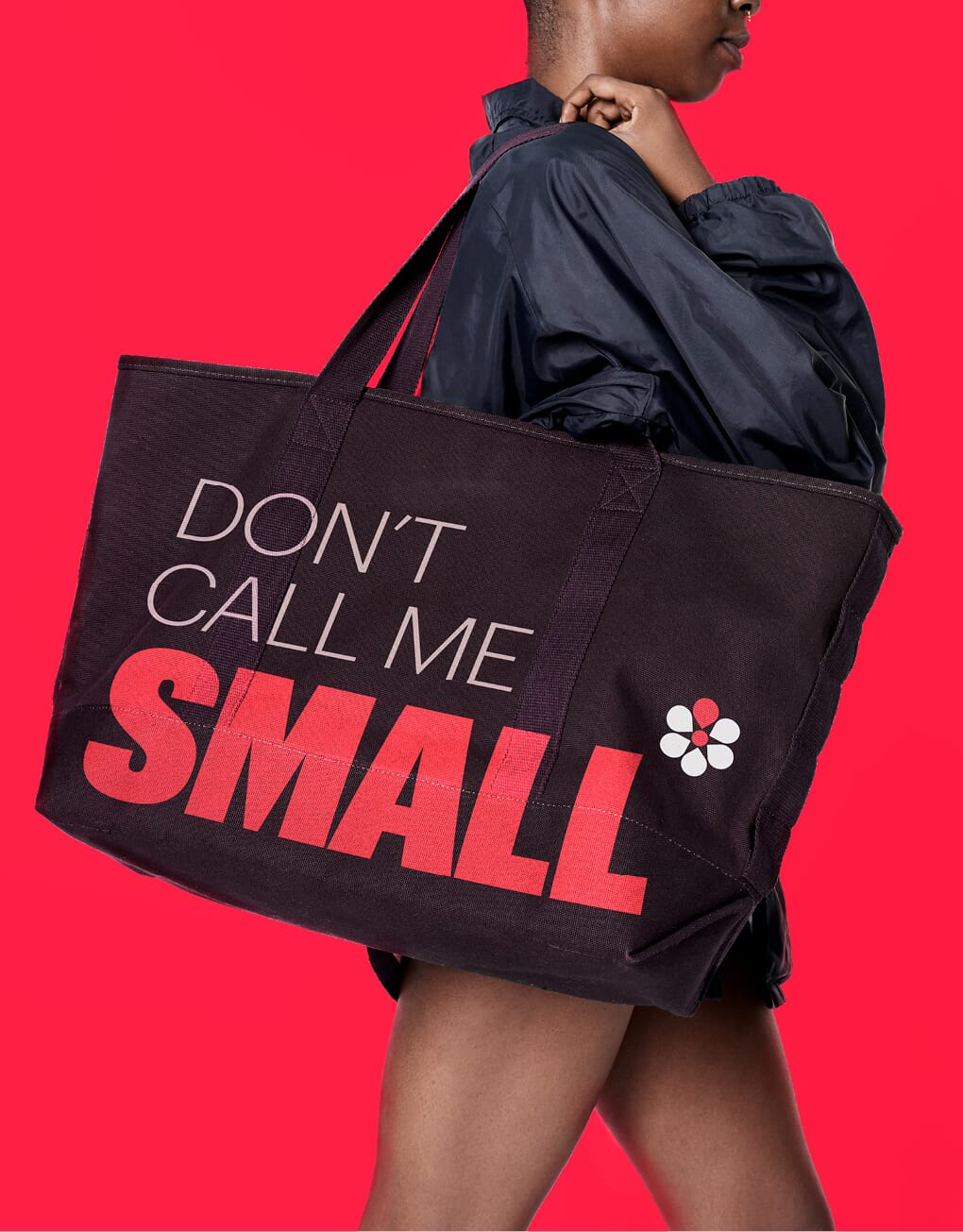
Together we searched for a more grounded, ‘community’ feel and more strident tone of voice – one that could flex across audiences without watering down the power of their reason to be. Their new core narrative reframes what ‘small’ really means – and how it can still be incredibly powerful.

We’re all for small.
Because small businesses make a big difference.
They support families, neighbourhoods and economies.
They put power in the hands of under-resourced communities.
But small businesses face big hurdles.
Especially when they’re Black, Brown or women-owned.
We’re here to level the playing field.
We provide access to the best financial, legal and marketing services
money can buy. Except – it’s free.
Our partners, volunteers and clients are united in their determination
to make a difference – one far greater than they could alone.
We’re all for small. Are you?
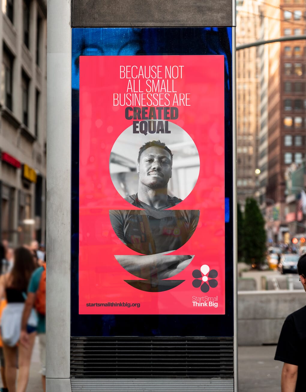
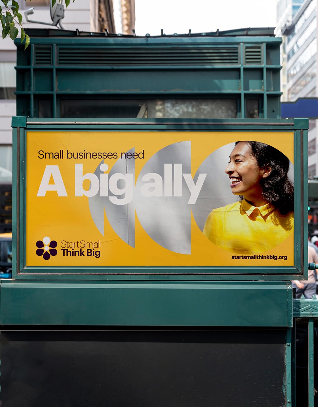
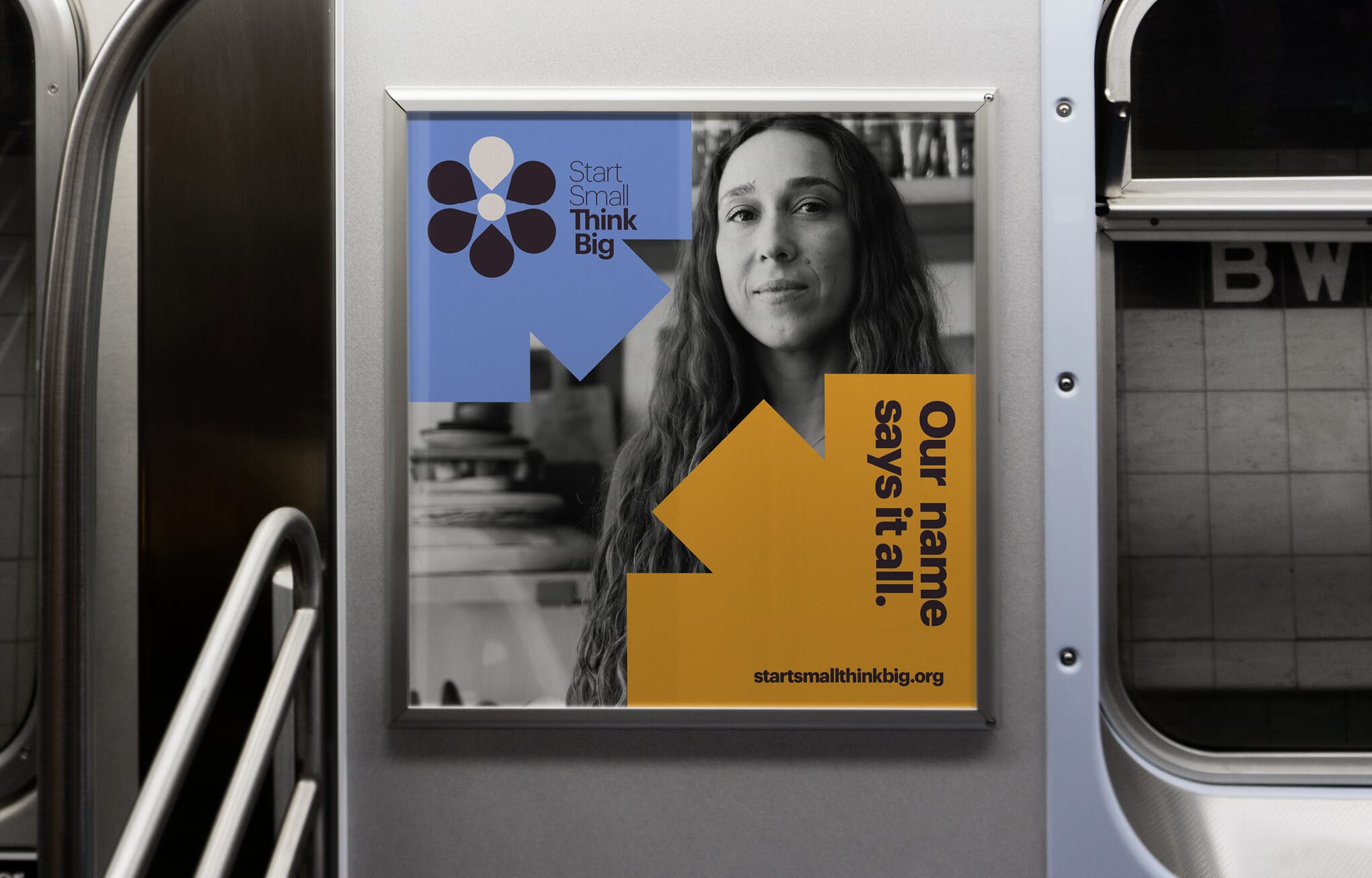
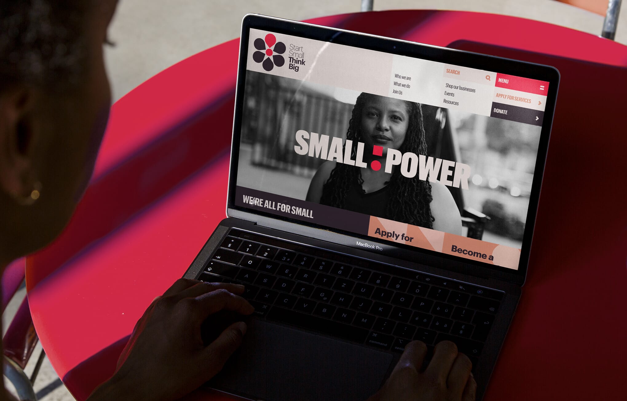
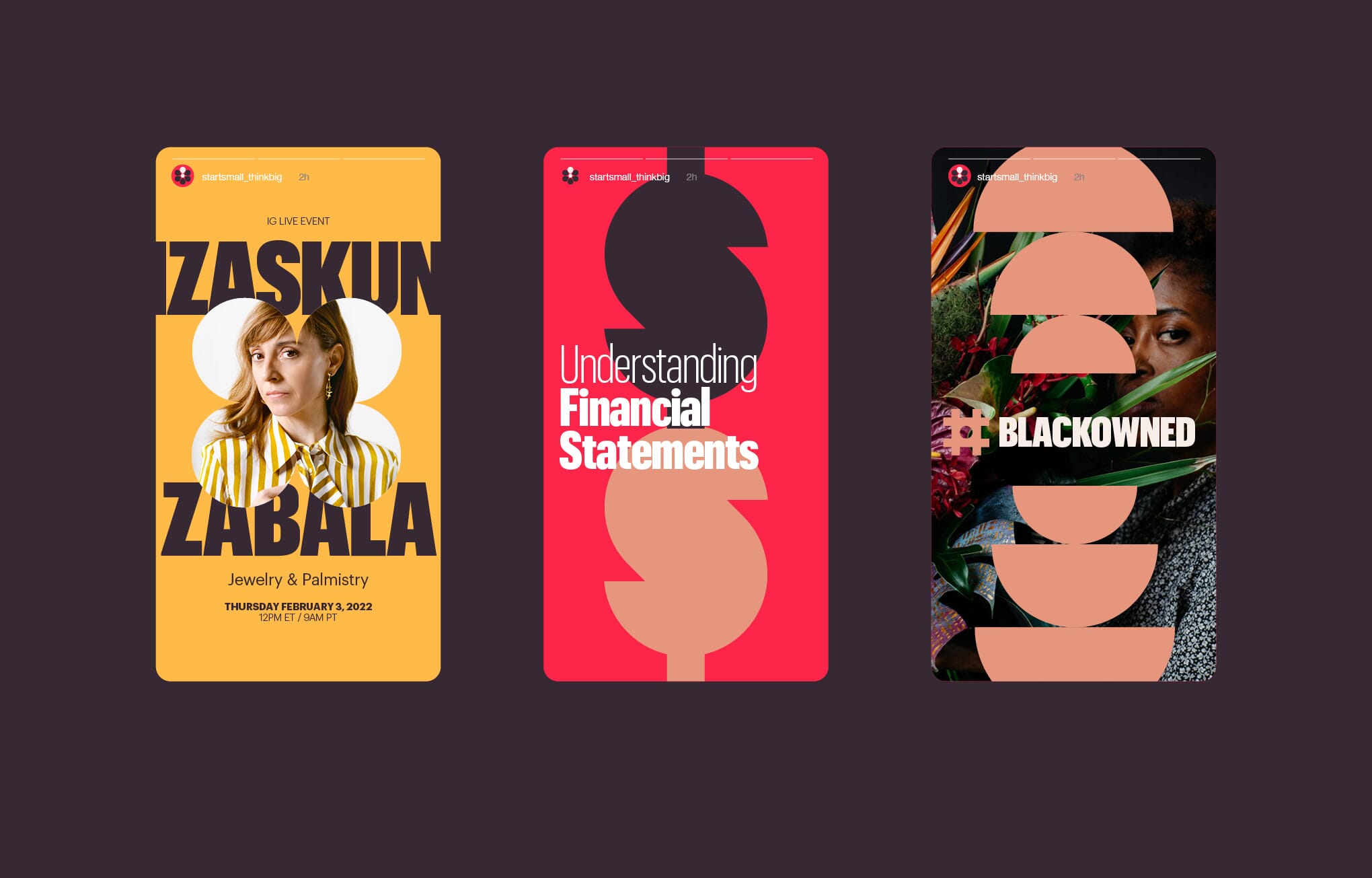
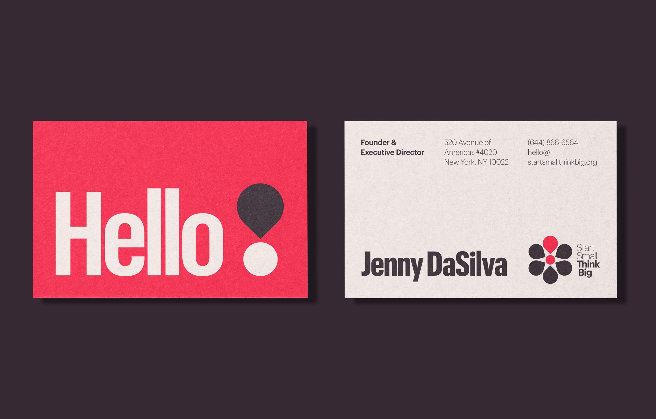
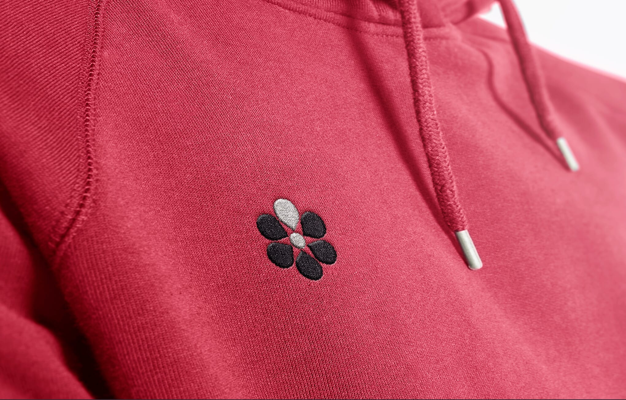
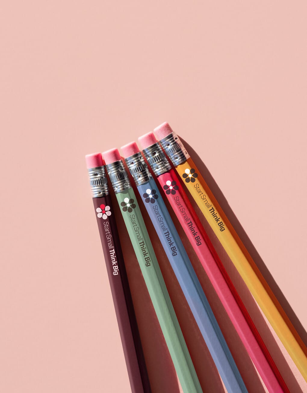
The new visual brand centres on an exclamation mark extracted from their old logo – which has been redrawn, rotated to illustrate the growth implied by their name, and hints at a flower in the process. This is then combined with their name, simply typeset in two weights, and a powerful new colour palette and graphic style.
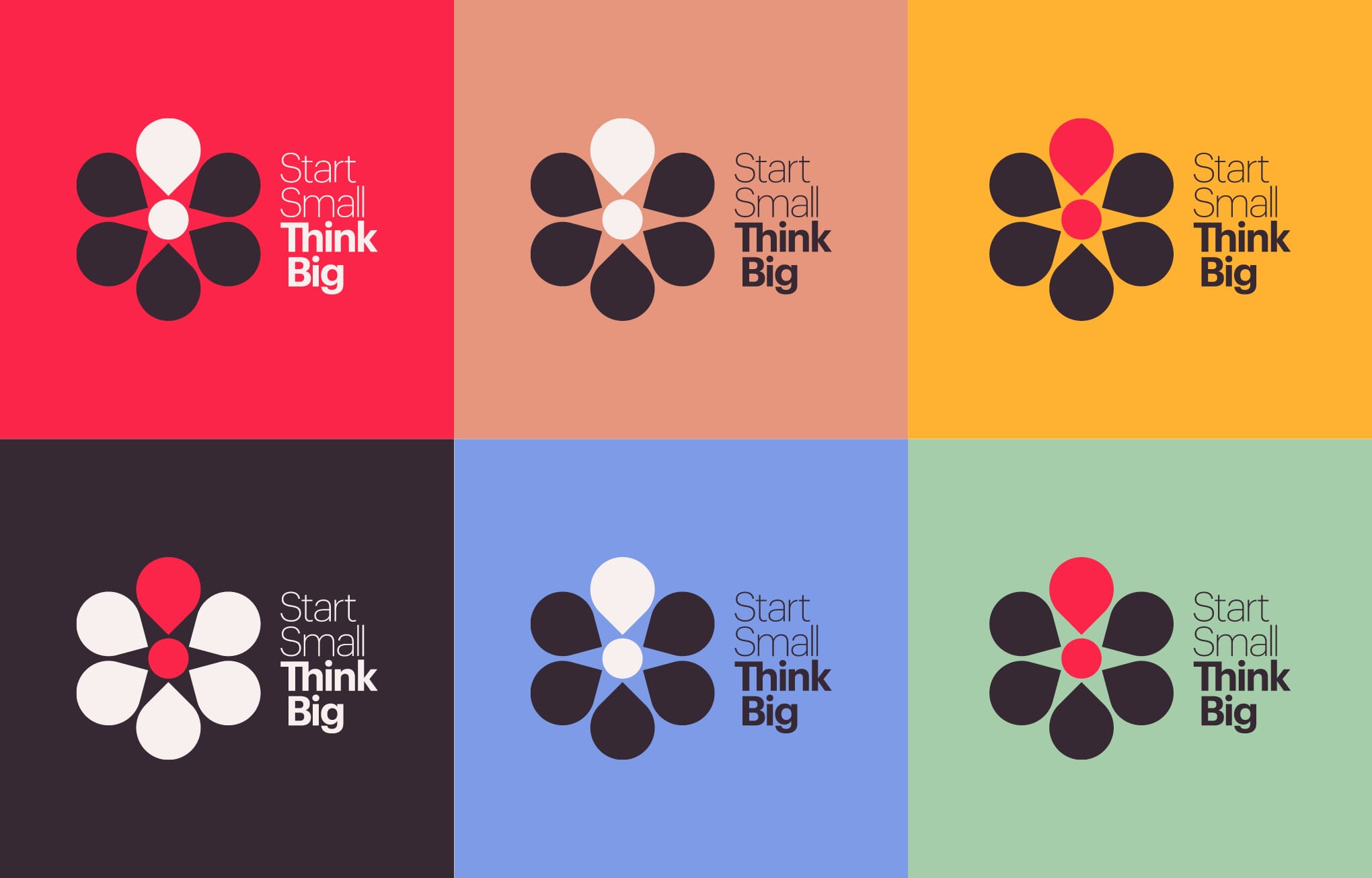
Because the new symbol is based on simple geometry, we’ve then extrapolated that into a fully-functioning graphic language of symbols, frames and devices that creates instant ‘graphic glue’ for the scheme and lends itself to simple and powerful animations.
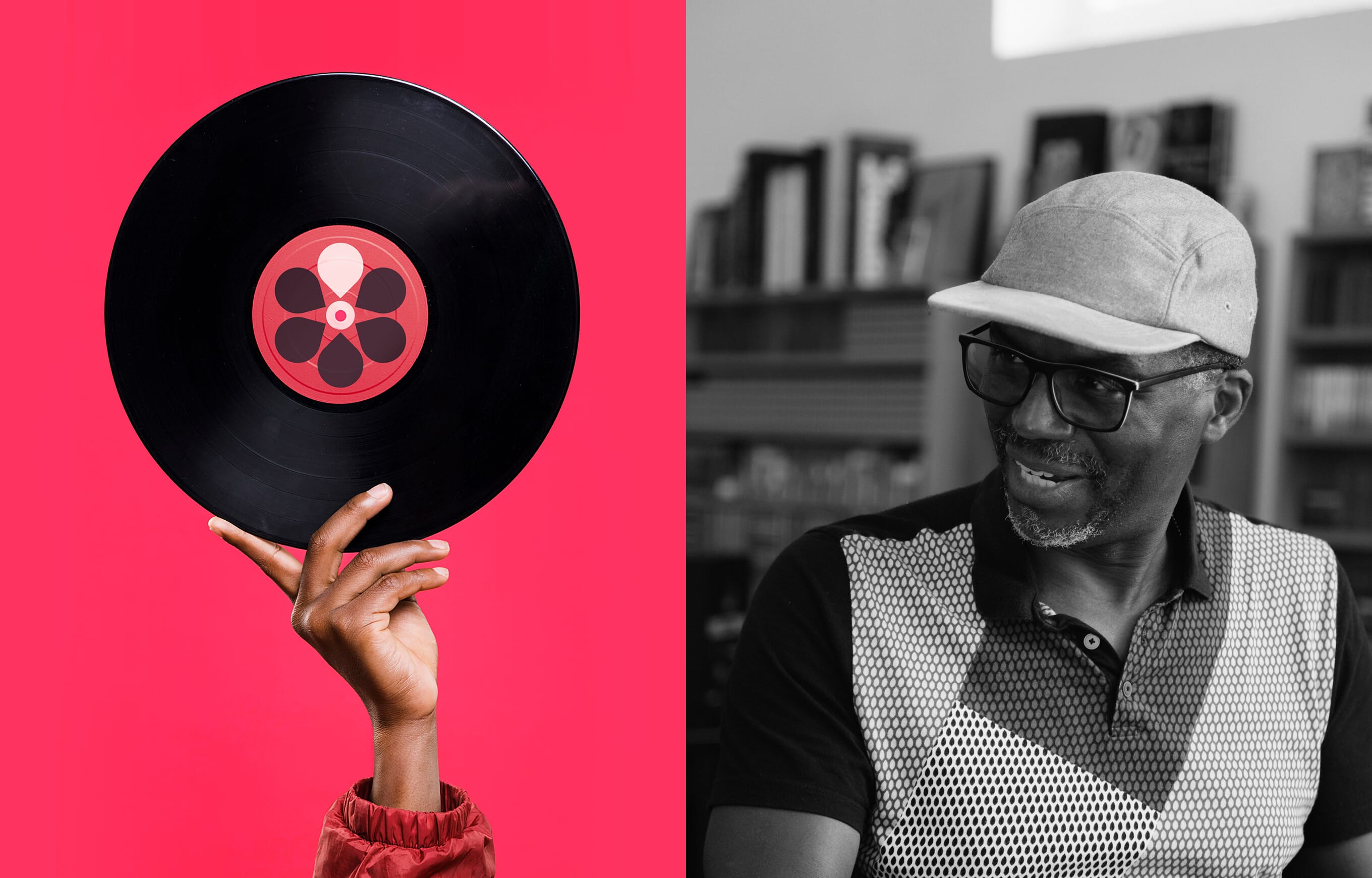
Crucial to the brand’s success is a bold tone of voice and an imagery approach that ‘heroes’ the business owners, using a mixture of black and white and colour images and video.


The team
- Design and branding: Johnson Banks
- Strategy: Johnson Banks & Studio Tomo
- Copywriting: Johnson Banks, Nick Asbury and Jen Chandler
- Animation: Johnson Banks & Jonathan Nielsen
- Photography: Sean R Wilkinson